Showing posts with label Signs. Show all posts

Jul 27, 2007

Five and Dime

This another sign illustration I produced in Freehand as a vector, then imported into Photoshop, and then added multiple texture layers to make the sign and bricks appear to be weathered.

I first created the vector illustration of the sign.


I then imported sections of the vector into photoshop and applied textures to give the sign a weathered feel.


I did a similar sign illustration for a previous SFG exercise where the subject was texture. Click here to view the post. I think I'm going to do a series of these signs. They are a lot of fun to produce.

Enjoy!

Steph D.

Jul 2, 2007

Texture - The Grill

For this weeks challenge I chose an old neon sign as the subject of my composition. I first created the vector illustration in freehand. See below.


After importing the vector illustration into photoshop, I applied three texture layers to the piece to give the sign the appearance of being weathered and a wood grain to the building.


Enjoy!

Jun 22, 2007

Bluegrass Boy


This design was done for a restaurant that has a bluegrass theme. I was excited at the chance to use some of my Sad Scribble techniques in the design process. I was slightly nervous though as to whether the client would like or appreciate the design, since it was not what they were expecting. But they loved it. The finished sign was 2' x 8'. As a bluegrass boy myself, I just really liked how it turned out.

May 19, 2007

Signs

www.timneedles.com


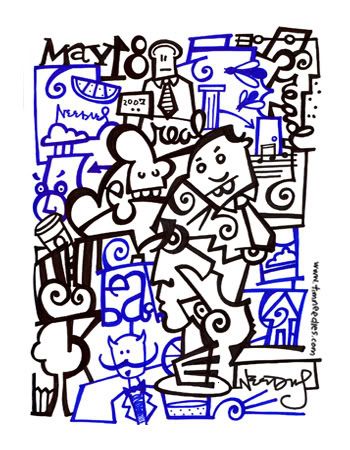
Here's a drawing I did for this week's Illustration Friday theme -signs.